Marketing Analytics Dashboard
A collection of analytics projects where I took messy, real world data and turned it into something actually useful through data wrangling, statistical visualization, and exploratory analysis.
Research & Analytics Workflow
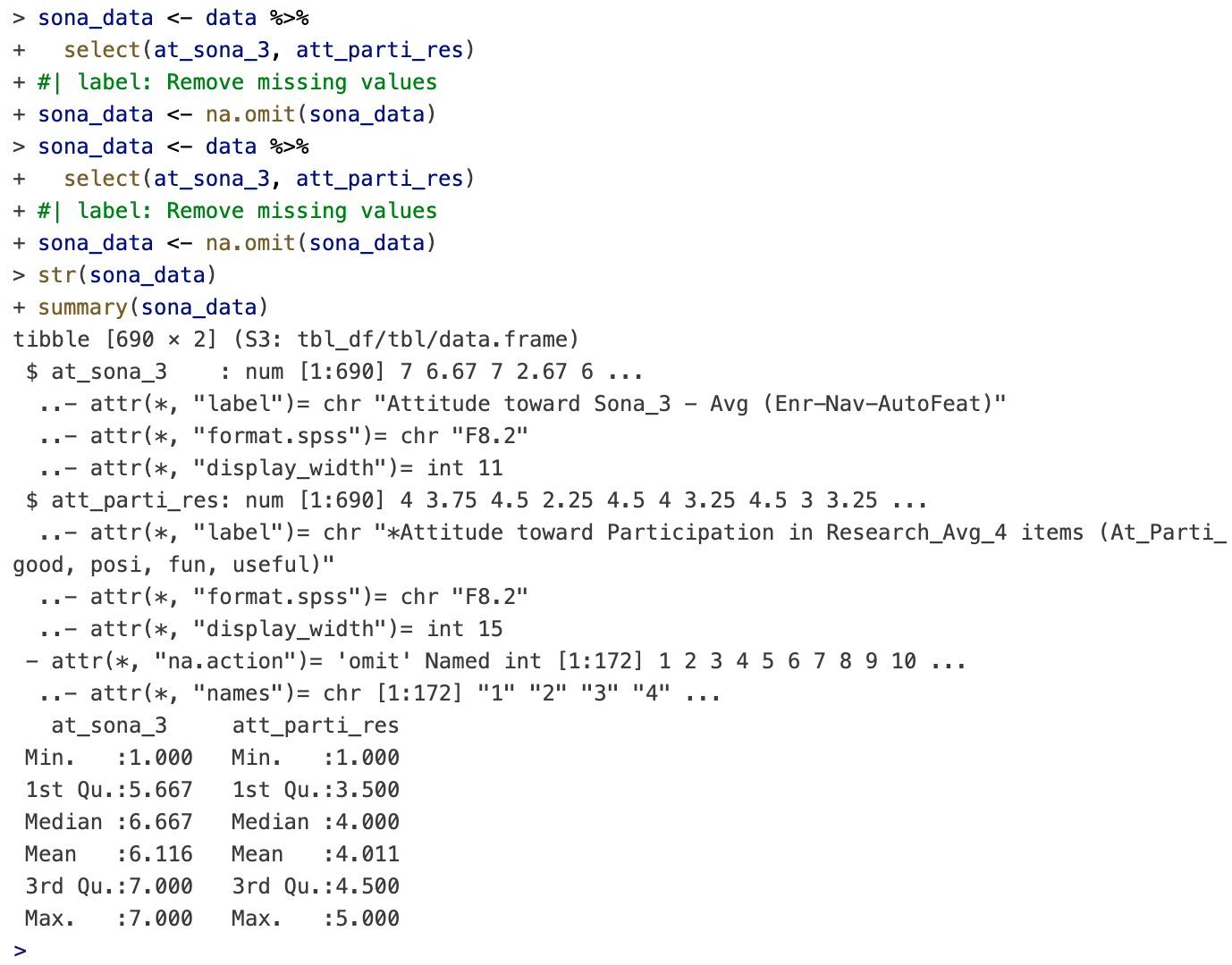
Data Wrangling & Cleaning
The dataset was imported and cleaned in R using structured data wrangling workflows. Variables unrelated to the research question were removed, missing observations were filtered out, and the remaining dataset was standardized for analysis.
This process improved consistency across observations and created a cleaner foundation for exploratory analysis and visualization.
Grouped Summary Analysis
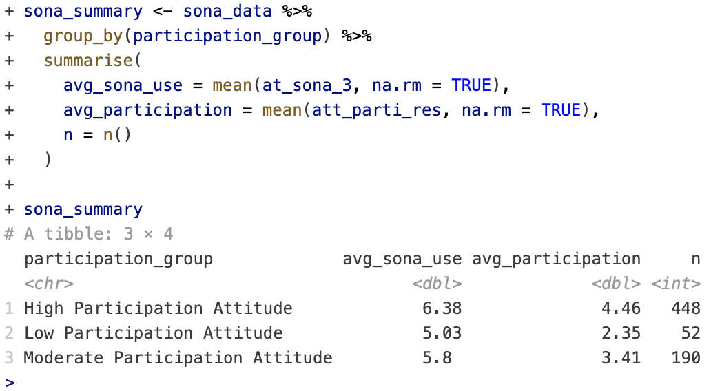
After cleaning the dataset, observations were grouped into participation attitude categories to compare average usability perceptions and participation sentiment across segments.
The grouped summaries helped identify trends in how students interacted with the Sona research participation platform.
Statistical Visualization & Findings
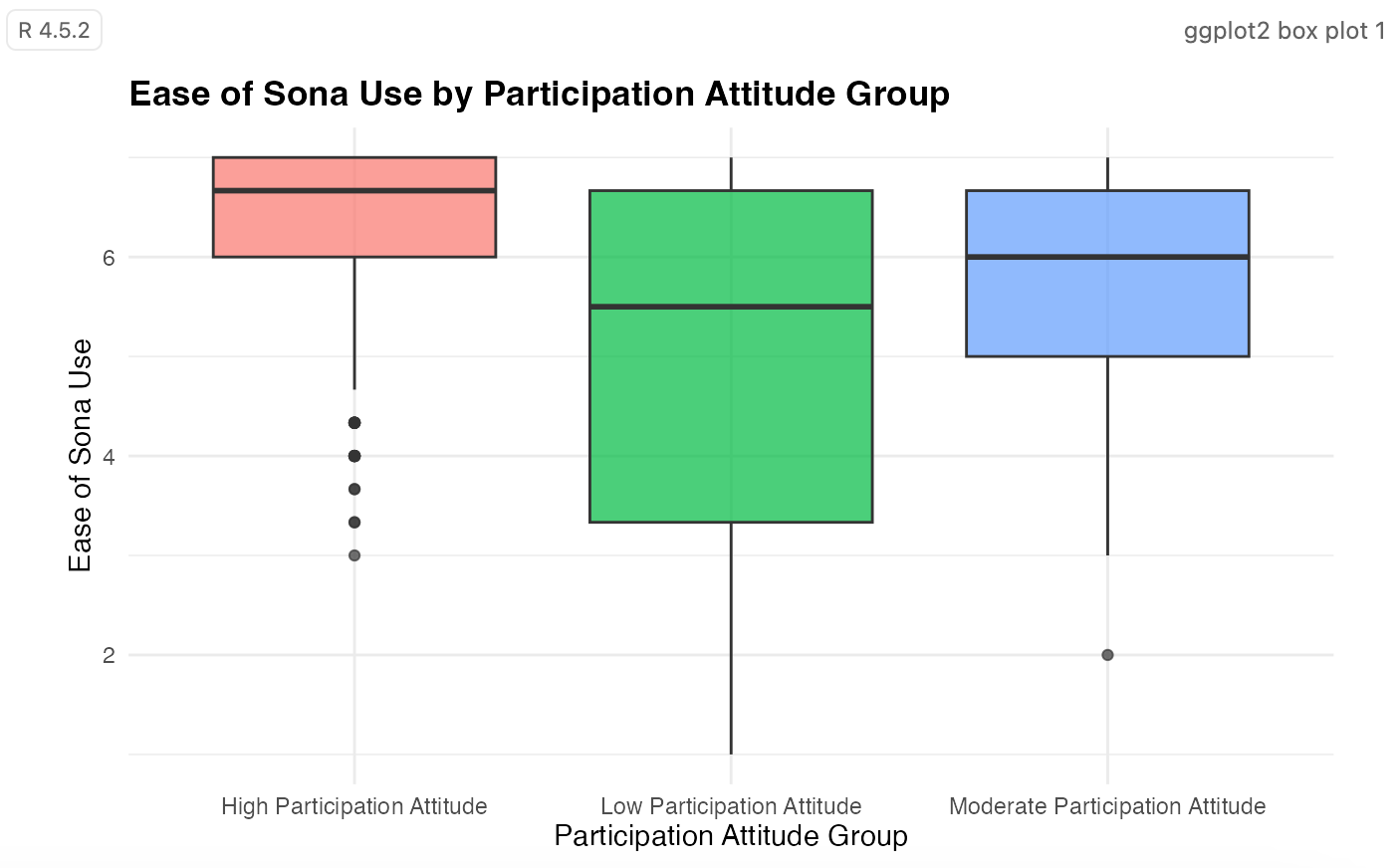
Participation Attitudes and Sona Usability
Students with more positive participation attitudes tended to report stronger usability experiences with Sona.
On the other hand, lower participation groups showed less consistency in their scores, suggesting that students who were less engaged tended to have a more uneven experience with the platform.
Relationship Analysis
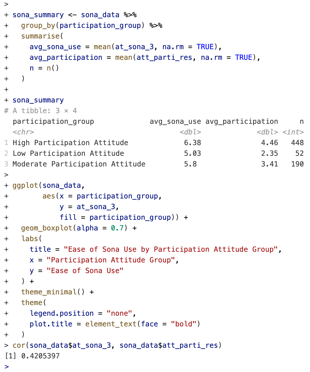
The analysis pointed to a moderate positive relationship between how usable students found Sona and how they felt about research participation overall.
Correlation Coefficient: 0.42
A positive correlation of 0.42 suggests that students who found the platform easier to use were generally more likely to report positive attitudes toward participating in research activities.
Tools & Technologies
Analytics Tools
- R
- Positron
- tidyverse
- ggplot2
- SPSS datasets
- GitHub
Analytical Skills
- Data wrangling
- Exploratory data analysis
- Statistical visualization
- Research interpretation
- Data storytelling
- Workflow management
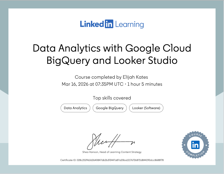
Certifications & Supplemental Training
Completed supplemental analytics training focused on:
- Google Cloud BigQuery
- Looker Studio
- Dashboard reporting workflows
- Data visualization concepts
- Analytics infrastructure fundamentals
These certifications strengthened experience working with reporting systems and analytical interpretation workflows commonly used in digital marketing and business analytics environments.